Here are a few highlights from the quarterly update of the RE-AMP Dashboard. An important note before you read further: the Dashboard was created to track important indicators prior to the conversations we have now had as a Network concerning the Equitable Deep Decarbonization framework. The indicators remain useful to help us understand progress toward some of our carbon reduction goals, but in the coming year we will be looking to update what we track, in order to better align with our shared analysis. If you would like to contribute to how we update the Dashboard with even more relevant indicators, please email Gail at gail@reamp.org.
Overall Emissions
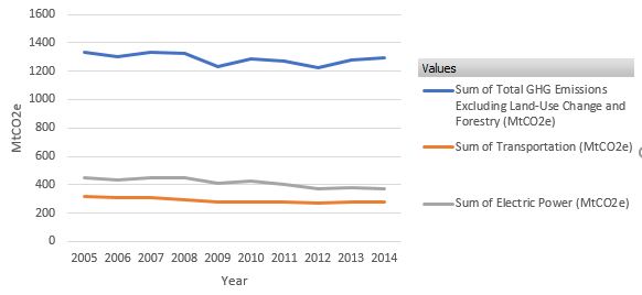
Figure 1: Total emissions and emissions from transportation and the power sector in the RE-AMP footprint (source: World Resources Institute)
The newest data from World Resources Institute takes us through 2014, and these data show that while emissions from electric power and transportation remained more or less level, overall emissions rose. What accounts for the increase? The largest percent increase came from fugitive emissions of methane (up 57% between 2011 and 2014), and the entire increase of this sort came from North Dakota. Ohio is the only other state with significant fugitive emissions, but they remained more or less level in the same time period in that state. It’s worth noting here that RE-AMP members in North Dakota have been working on this issue ever since learning about the scale of the problem at the 2010 RE-AMP Annual Meeting. With support from the Network’s Global Warming Strategic Action Fund, they have worked to push the amount of methane being flared from a staggering 30% down to 14%, and have forced the Department of Mineral Resources to begin including flaring statistics in monthly reports, as well as worked with the state to create benchmarks to bring flaring down to the national average.

Figure 2: Emissions from Commercial, Residential, Industrial and Fugitive sources in the RE-AMP footprint (source: World Resources Institute)
Although the percent increase is smaller for industrial emissions (8% between 2011-2014), the tons of emissions coming from industrial processes (12 Megatons of Carbon Dioxide Equivalent, or MtCO2e) were slightly larger than from fugitive emissions (11 MtCO2e). Residential emissions, up 13%, represented roughly the same volume of tonnage increase as fugitive emissions, while emissions from the commercial sector rose by 15%, and accounted for about 8 MtCO2e.
Power Sector
In addition to tracking data about fossil fuel, nuclear, and renewable fuels in the power sector, this quarter’s update includes a chart breaking down fossil fuel data to show the amount of generation from coal and the amount from gas. Not surprisingly, the lines showing coal and gas usage are almost inverted images of each other. As coal has dropped, gas has risen in roughly equal measure, year over year. We do nonetheless see overall fossil fuel usage trending down in every state in our footprint.
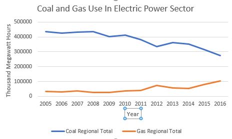
Figure 3: Use of coal and gas fuels in the power sector in the RE-AMP footprint (source: US Energy Information Administration)
On the renewable front, Iowa continues to show us how it’s done, far surpassing the renewable generation in the next best state, Minnesota. Wisconsin, Ohio and Michigan all present troubling declines in renewables since 2015, according to EIA data. Illinois and South Dakota remained fairly flat, while North Dakota’s renewable generation is trending up and could even overtake Illinois.
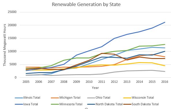
Figure 4: Renewable generation by state (source: Energy Information Administration)
We’ve come a long way since 2005, thanks to the incredible work of members like you! It’s highly satisfying to see the trend lines for renewables coming up and for fossil fuels going down, and to know that the cleaner air is not only giving us a shot at solving the climate crisis, but saving countless lives and improving the health of millions of people. Thanks for all you do!